Most common drawing mistakes
Everyone makes mistakes, even in while drawing. In this article, you will find a list of most common drawing mistakes made by beginner artists Take a look and find out, which one you can find in your artworks. Don’t worry, a systematic practice and elimination of those mistakes raise our level, so it will be good as everybody knows the mistakes.
1. Messy Colors – Using Burn/Dodge Tool (in Photoshop)
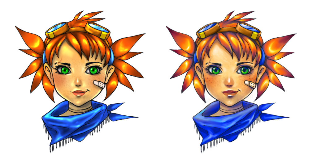
There are artists who are pretty good at sketching and creating a lineart. The problem arises when they have to deal with the color. Avoid using Burn and Dodge tools to put shadows and lights while coloring drawing in Photoshop. If you create an artwork with traditional media, don’t use black paint to create shadows, or white, to draw highlights. Use color instead.
If you are not familiar with Photoshop, and are wondering what this tool does, here’s Adobe’s description:
- The Dodge tool and the Burn tool lighten or darken areas of the image. These tools are based on a traditional darkroom technique for regulating exposure on specific areas of a print. Photographers hold back light to lighten an area on the print (dodging) or increase the exposure to darken areas on a print (burning). The more you paint over an area with the Dodge or Burn tool, the lighter or darker it becomes.
It’s a great tool when it is used properly. But it’s often overused by beginners.
Also, before putting the color you need to know where and how strong the light falls and in what color range the scene should happen.
2. Bad anatomy
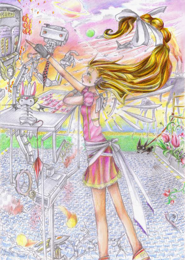
It’s one of most common mistakes. Often resulting in some quite funny outcomes, sometimes destroying the entire work of the author. If your teacher/parent/friend tells you to stop to draw in manga/comic style, and try instead realistic drawings, they have a point. It’s okay to have your own style of drawing, however, having a knowledge how the human body looks like, how it works and it’s the proper proportions, gives you a huge boost. Anatomy is not only the domain of realistic drawing. Even in a caricature or cartoon, each body has some proportions that must be preserved.
To improve your artworks, practice every day drawing poses. Prepare a photo reference before starting drawing, – almost every professional has his own library with photo references (remember about copyright policy).
3. Focusing on details instead of whole base
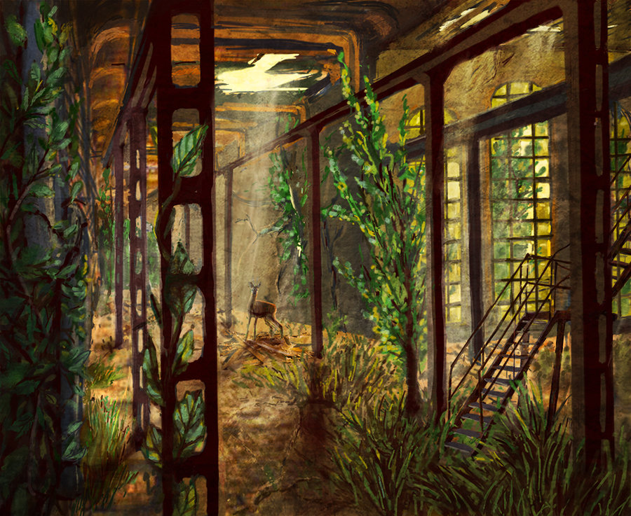
A lot of people want to finish drawing before it starts and focus on what gives it the most satisfaction. That’s not the right way. Yeah, detailed drawings are great, but too many details on a drawing may also be bad (you see my example above, it looks really messy). There are many problems with this drawing here, I focused too much on details and textures instead of composition and light.
4. Poor perspective abbreviations
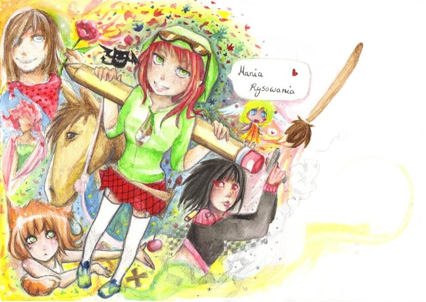
Good perspective shortcuts in drawings are the domain of people after art schools or architects, whereas amateurs have always had problems with it. This is one of the hardest things to draw. It requires experience and perfect spatial imagination. Fortunately, with a practice and patience, you can master it.
5. Bad composition
A composition is such a wise definition of arranging things in a given space. The space of the comic bookmakers is both the page and the frames on the page. Good composition means that the image does not run away in any direction, that the most important things should be exposed. And also to ensure that there is an appropriate “flow”, meaning the movement/direction in which the content of the picture is going, also in comic. The point is that the reader doesn’t feel confused on what exactly look, or in which order he should read the frames in the comic.
6.Incorrect speech balloons.
Comic speech balloon is such an ungrateful medium, which in a comic must sometimes be and must be taken into account when designing frames- the order of speech balloons, and their size. A lot of cartoonists doesn’t care about speech balloons. They stuff large amounts of text, without taking into account the white space, use illegible or non-matching fonts (including the famous Comic Sans), or direct the arrows of balloons into strange parts of the body of the character.
7. Use of textures and filters
Some people can overdo it. They forget that Photoshop is a tool primarily for photo processing. They throw on textures, light effects or flares completely meaningless. These tools require intuition and a lot of practice to avoid artificiality and “plasticity”. They are supposed to be an addition to a well-placed color, not a method for such a color.
Other popular mistakes are: not drawing the background in frames, poor drawing of clothes, not drawing the legs of a character (it is rather the manner of lack of skill – but more on that later), clumsy attempts to destroy the style of known cartoonists, improper use of blur and “finger” for creating a motion effect.

